9 Inspiring Design Event Landing Pages for Fall 2023
A well-designed and informative website plays a crucial role in shaping the perception of an event. It acts as the cornerstone for establishing the mood of the event and providing crucial details and contact information.
To ignite your creative spark for creating exceptional designs I have put together a collection of 9 remarkable event websites for autumn 2023 that illustrate the heights of imagination in design.
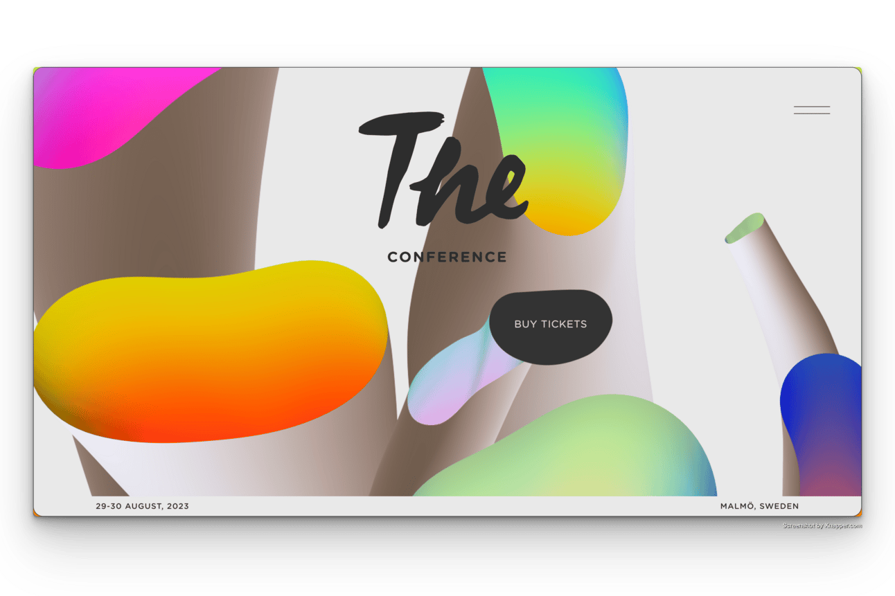
1. The Conference
🔗 theconference.se
Designer: Zach Lieberman
The conference, a two-day gathering in Malmö, Sweden, has its own annual identity designed by an artist for each edition. This year by new media artist Zach Lieberman.
2. Brand New Conference
🔗 underconsideration.com/brandnewconference
Designers: Bryony Gomez-Palacio and Armin Vit
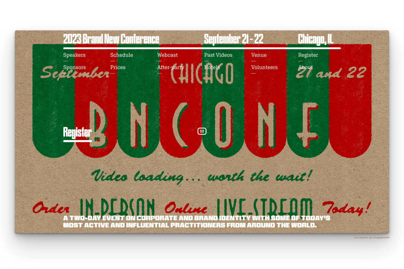
The Brand New Conference, a touring annual event in the US. It takes inspiration from the city where the event takes place to shape its unique identity. Read the full story behind this year's creative identity, 'The Kraft of Pizza-making'.
3. Hatch Conference
🔗 hatchconference.com
Designer: Damian Martone
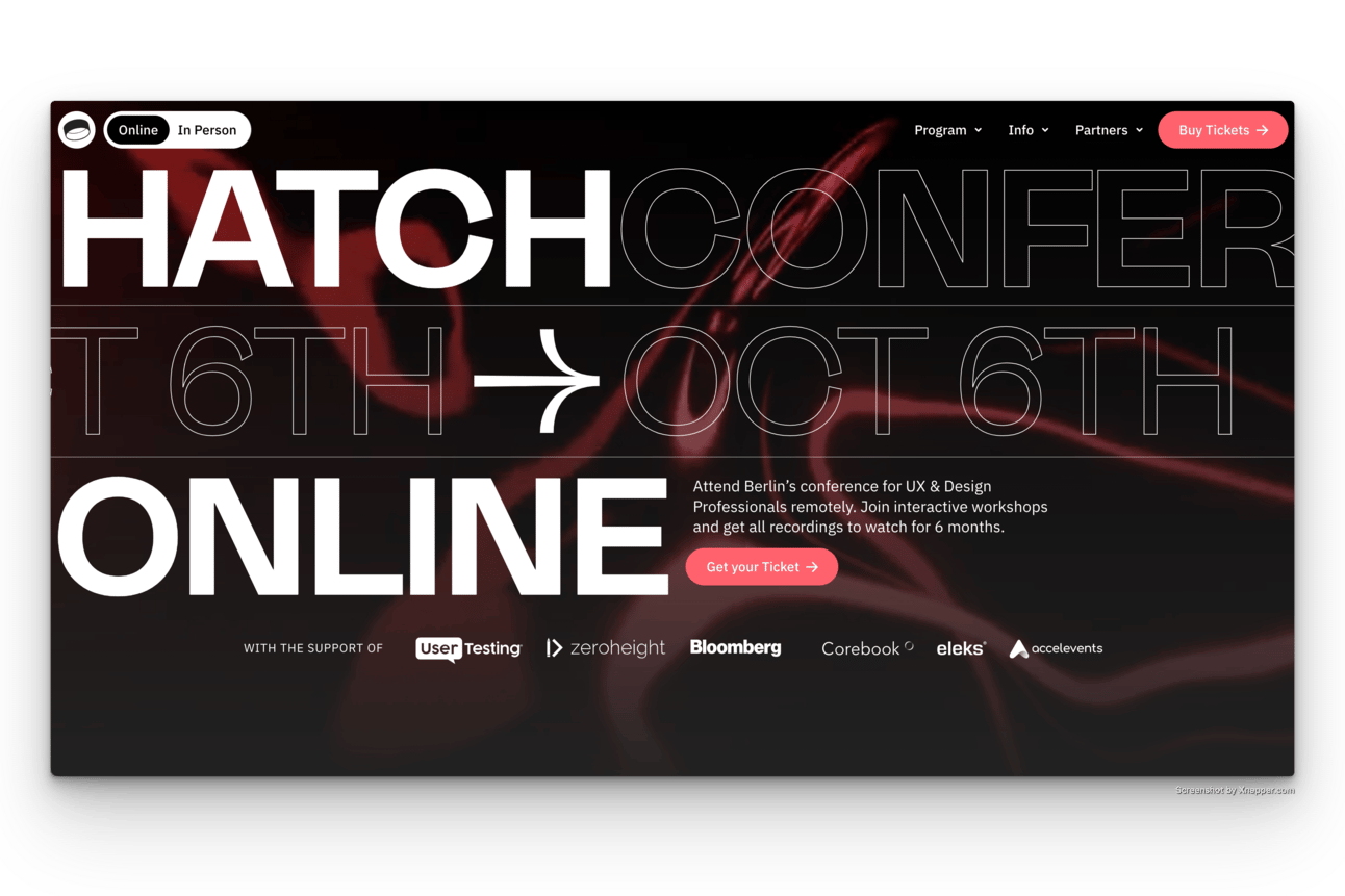
The Hatch Conference, an annual meeting focused on product design, uses Framer and the contemporary Freigeist Wide Medium font to give its website a distinctive and personal touch.
4. OFFF TLV
🔗 offftlv.com
Designers: Yambo Studio + In-house team
OFFF TLV, a centre for pioneering visual creators, immerses its landing pages in catchy images and engaging background videos.

5. Y Oslo
🔗 y-oslo.com
Designer: Will Hindson
Since its inception in 2019, Y's visual aesthetic has adhered to green, black, and white tones, complemented by the bespoke custom Netlife Sans by Dinamo. The result is an engaging, clean yet playful style.

6. Blanc!
🔗 blancfestival.ccom
Design: In-house team
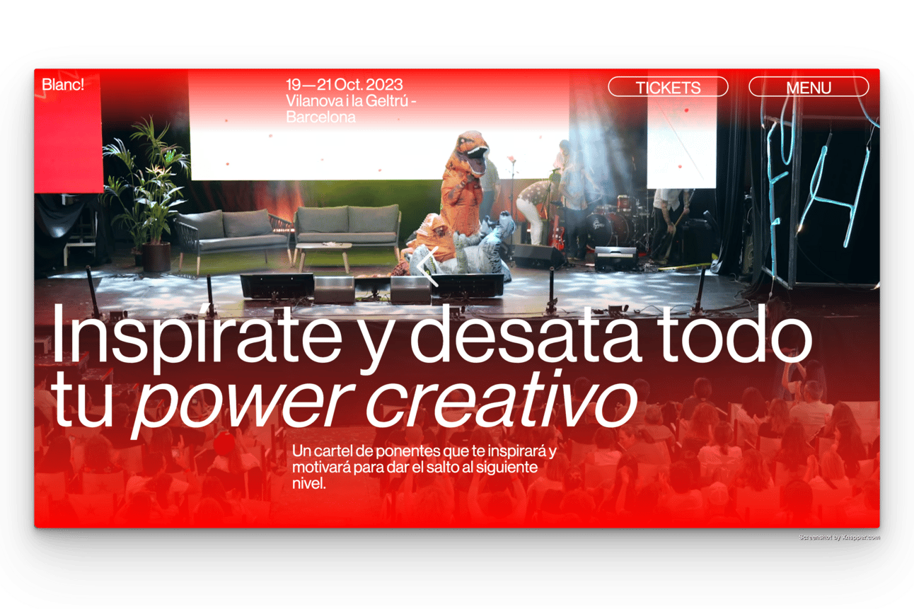
Blanc!, a festival covering branding, innovation and art direction, embraces a long-scroll blog-style layout decorated with overlapping gradients and bold Neue Haas Grotesk typesetting.
7. Never Permanent 2023
🔗 semipermanent.com
Design: In-house team
Never Permanent is an exclusive talk series about the dynamic intersection of creativity and technology. The website has a clean, well structured landing page with ingenious links to segments.

8. Naive Yearly
🔗 naiveyearly.com
Designer: Studio Hollywood
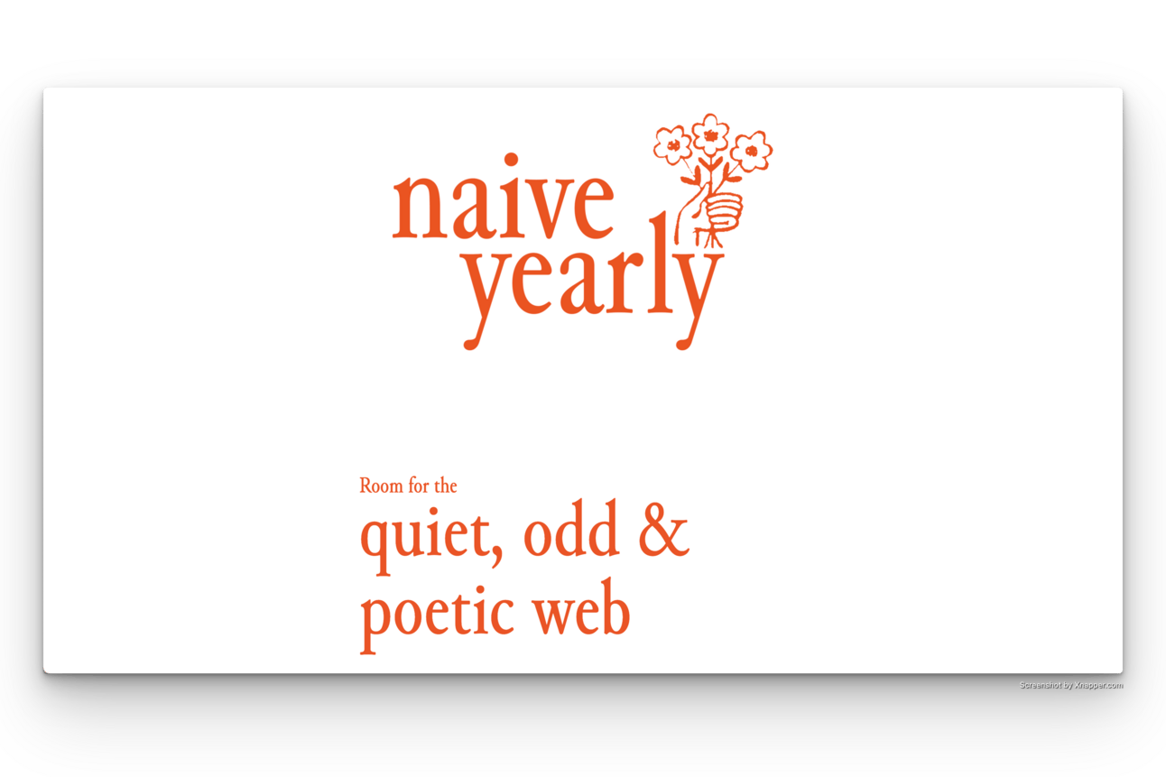
New to the scene is Naive Yearly, an event championing the quiet, unconventional and poetic web. The text-centric site, styled in Abel font and without images, aptly reflects this aesthetic.
9. AGI Open
🔗 agi-open.com
Designer: Sons&co
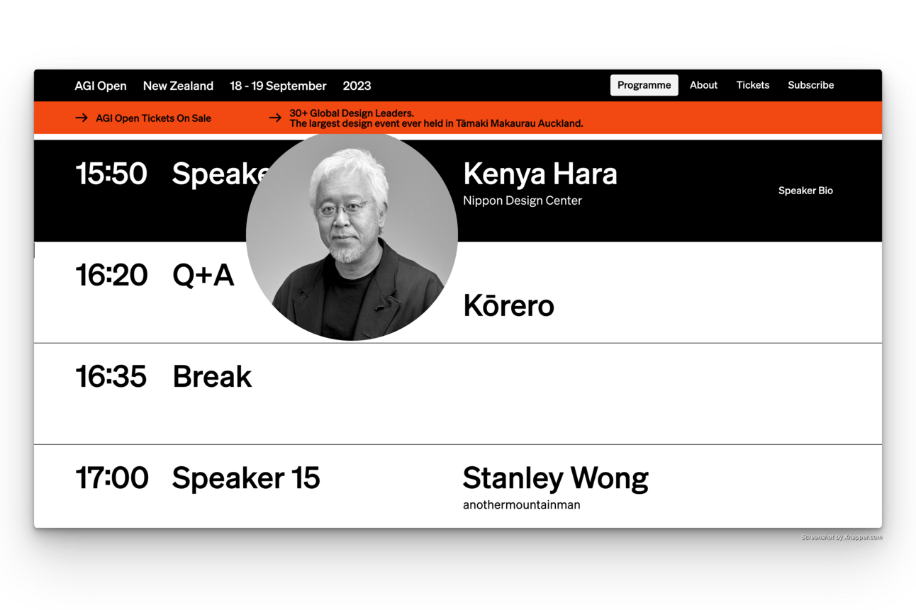
AGI Open boasts a minimalist international layout, adorned with three primary colors and employing scroll hijacking for a refined experience.
These extraordinary visual design conference websites exemplify the fusion of creativity, technology, and aesthetics, setting a high bar for event website design.
Explore all upcoming events on neonmoire.com/events
📋 Recently attended an event?
Leave a review and help other creatives find their event in the future.
Explore upcoming events in
☃️ January | 💕 February | 🌱 March | ☔️ April | 🌸 May | ☀️ June | 🎆 July🍉 August | 🍂 September | 🎃 October | 🦃 November | 🎄 December
📡 Online | 🌎 North America | 💃 Latin America | 🇪🇺 Europe
🌍 Africa | 🕌 Middle East | ⛩ Asia | 🏄♂️ Oceania
👋
Organize an event?
Are you or do you have a friend/colleague who organizes a workshop, field trip, meet-up, festival, or conference and it’s a good fit for Neon Moiré? You are invited to add the upcoming event to our event guide.❤️
If this edition of our newsletter “Neon Monday” inspired you, share it with a friend, and you want to help me make more like it, buy me a coffee or sponsor this newsletter to get your message in front of 2.5K+ creators.
Want to promote your a talk you give? drop me a link.
Waving from Delft,
Thomas ✌️
DISCLAIMER: Some links are affiliate links. It doesn't cost you extra to buy through those and I just get a tiny commission. Thank you!
Share this weeks edition
/
It is now possible to comment on our newsletter. Please do so! Sending a personal reply is also very much appreciated.


